UPDATE: CTP has been rebuilt targeting the 13.1 volume (SL – 13.1.20131.2104 and WPF – 13.1.20131.2108)
Back before I worked at Infragistics, I was the author of an open source project on CodePlex called the Extended WPF Toolkit. You may or may not have heard of it. One of the most popular controls in my toolkit was the PropertyGrid control. When I came to work for Infragistics as a Product Manager, I was constantly asked when I would bring a property grid control to the NetAdvantage for WPF and Silverlight products. Infragistics has a team of very smart and talented engineers that write controls and fix bugs all day everyday. Unfortunately, we have so many controls to maintain, and multiple products and platforms to support, it is hard to get everything we want in a release. So I took it upon myself to leverage the experience I gained writing controls for my Extended WPF Toolkit, and decided to write a cross platform (WPF and Silverlight) property grid control for Infragistics called the XamPropertyGrid.
Keep in mind, that I wrote this during the free time between my normal PM responsibilities and my other community efforts. I only spent a week on it to far. So that means that this is a CTP in every sense of the word. The code base is only 5 days old. Features are missing and there are plenty of bugs in it. Why am I releasing it then? I want your feedback. Let me know what you want it to do. Help me find the bugs. You can shape the direction of this control.
The XamPropertyGrid
The XamPropertyGrid control allows you to browse and edit properties on any .NET object. The XamPropertyGrid allows you to auto-generate all properties or specify the specific properties you want to display. You can use one of the 12 standard editors that are provided with the XamPropertyGrid or you can use custom editors that target a Type, specific properties, a group (more on this later), or all three. The XamPropertyGrid also supports complex properties, which allows you to drill down into a nested property hierarchy.

Properties:
| Property | Description |
| AutogenerateProperties | If set to true (defaut), the XamPropertyGrid will display every public and browsable property on the object. If set to false, you will need to specify which properties to show. |
| EditorDefinitions | A collection of EditorDefinition that allows you to provide an editor for a specific type, property group, or set of property names. |
| Filter | The text to search the properties |
| FilterVisibility | Controls the visibility of the Filter textbox. |
| HeaderVisbility | Controls the visibility of the object header information |
| IsCategorized | Gets/Sets whether or not the properties are displayed as categories of alphabetical order. |
| InformationPaneVsbility | Controls the visibility of the information pane |
| NameColumnWidth | gets/sets the width of the name column |
| Properties | gets the properties (as a PropertyDefinition) of the SelectedObject |
| PropertyDefinitions | a collection of PropertyDefinition that allows you to specify which properties to display. Used when AutogenerateProperties = false |
| SelectedObject | the object to display and edit the properties for |
| SelectedObjectName | sets the name of the SwelectedObject. Is the SelectedObject is a FrameworkElement, this is automatically set. |
| SelectedObjectTypeName | gets/sets the name of the type of the SelectedObject |
| SelectedPropertyRow | gets/sets the selected property row |
| SortAndCategoryVisbility | controls the visibility of the sort and category options |
Specifying Properties
As mentioned earlier, by default the XamPropertGrid will automatically create a PropertyDefinition for each public property that is browsable (if using the BrowsableAttribute). You can override this behavior by setting the AutoGenerateProperties property to False, and then provide a collection of PropertyDefinitions for the properties you would like to show.
AutoGenerateProperties=”False”
SelectedObject=”{Binding Person}“>
<ig:XamPropertyGrid.PropertyDefinitions>
<ig:PropertyDefinitionCollection>
<ig:PropertyDefinition Name=”FirstName” />
<ig:PropertyDefinition Name=”Age” />
<!– overide property information as well as editors–>
<ig:PropertyDefinition Name=”LastName”
DisplayName=”My Cool Last Name”
Category=”My Custom Category”
Description=”My Custom decription”>
<ig:PropertyDefinition.EditTemplate>
<DataTemplate>
<Border BorderBrush=”DodgerBlue” BorderThickness=”2″ Background=”LightSkyBlue”>
<TextBox BorderThickness=”0″ Background=”Transparent” Text=”{Binding Value, Mode=TwoWay}” />
</Border>
</DataTemplate>
</ig:PropertyDefinition.EditTemplate>
<ig:PropertyDefinition.DisplayTemplate>
<DataTemplate>
<Border BorderBrush=”DodgerBlue” BorderThickness=”2″ Background=”LightSlateGray”>
<TextBlock Text=”{Binding Value}” />
</Border>
</DataTemplate>
</ig:PropertyDefinition.DisplayTemplate>
</ig:PropertyDefinition>
</ig:PropertyDefinitionCollection>
</ig:XamPropertyGrid.PropertyDefinitions>
</ig:XamPropertyGrid>
If only the Name property is specified, the property matching that name will be shown in the XamPropertyGrid if it exists on the object. The information about that object will be retrieved from any attributes that the property may be decorated with (DisplayAttribute for example). The developer can also override the property information by setting the respective PropertyDefinition properties. The developer can also override the default property editor by specifying the EditTemplate and DisplayTemplate properties.
A PropertyDefintion has the following public properties:
| Property | Description |
| Category | Get/sets the property category |
| DisplayName | Gets/sets the display name of property |
| Description | Get/sets the description of the property |
| DisplayTemplate | Gets/sets the DataTemplate to use when the property is readonly |
| EditTempate | Gets/sets the DataTemplate to use when the property is editable |
| IsReadOnly | Gets/sets if the property is editable |
| Name | The name of the property to display |
| Order (need to implement) | The order the property should be listed in the XamPropertyGrid |
Editors
By default the editor currently comes with 12 built-in property editors:
- CheckBox Editor
- Color Editor
- Combo Editor
- DateTime Editor
- Enum Editor
- Font Stretch Editor
- Font Style Editor
- Font Weight Editor
- Font Family Editor (WPF only)
- Numeric Editor
- TextBlock Editor
- TextBox Editor
As mentioned earlier, if one of the default editors doesn’t meet your needs, or you have a custom editor you would rather use, you can easily override the default editors with and editor of your choice. This can be done in a number of ways.
PropertyDefinition
As previously mentioned, the default editors can be overridden by specifying the EditTemplate and DisplayTemplate on a PropertyDeifinition. This only come into play when you are explicitly specifying properties and setting the AutoGenerateProperties = False.
EditorDefinitions
You can also specify an editor based on the Type of the property, the property name, a property group, or all three with a single definition.
SelectedObject=”{Binding Person}“>
<ig:XamPropertyGrid.EditorDefinitions>
<ig:EditorDefinitionCollection>
<!– This EditorDefinition will provide a TextBox to any property that has any of the defined property names, belongs to the specified group
or is of Type Boolean, replacing the default editor. –>
<ig:EditorDefinition TargetType=”{igMarkup:Type TypeName=sys:Boolean}” Group=”MyControlGroup”>
<ig:EditorDefinition.TargetProperties>
<ig:TargetProperty Name=”FirstName” />
<ig:TargetProperty Name=”LastName” />
<ig:TargetProperty Name=”Age” />
<ig:TargetProperty Name=”WritingFont” />
</ig:EditorDefinition.TargetProperties>
<ig:EditorDefinition.EditTemplate>
<DataTemplate>
<Border BorderBrush=”DodgerBlue” BorderThickness=”2″ Background=”LightSkyBlue”>
<TextBox BorderThickness=”0″ Background=”Transparent” Text=”{Binding Value, Mode=TwoWay}” />
</Border>
</DataTemplate>
</ig:EditorDefinition.EditTemplate>
<ig:EditorDefinition.DisplayTemplate>
<DataTemplate>
<Border BorderBrush=”DodgerBlue” BorderThickness=”2″ Background=”LightSlateGray”>
<TextBlock Text=”{Binding Value}” />
</Border>
</DataTemplate>
</ig:EditorDefinition.DisplayTemplate>
</ig:EditorDefinition>
</ig:EditorDefinitionCollection>
</ig:XamPropertyGrid.EditorDefinitions>
</ig:XamPropertyGrid>
EditorAttribute
Don’t like DataTemplates? No problem! You can supply editors for a property by using the Infragistics.ComponentModel.DataAnnotations.EditorAttribute. The editor being applied must be of type FrameworkElement.
{
double _gradePointAvg;
[Display(Name = “Grade Point Average”, GroupName = “Information”)]
[Description(“This property uses the XamNumericInput as the default editor.”)]
publicdouble GradePointAvg
{
get { return _gradePointAvg; }
set
{
_gradePointAvg = value;
NotifyPropertyChanged(“GradePointAvg”);
}
} int _age;
[Category(“Information”)]
[Display(Name = “Age”, GroupName = “Information”)]
[Description(“This property uses the XamNumericInput as the default editor.”)]
//custom editor with just the namespace of the control specified.
[Infragistics.ComponentModel.DataAnnotations.Editor(TypeName = “XamPropertyGridSandbox.CoolCustomControl”, ValueProperty = “MyCustomValueProperty”)]
publicint Age
{
get { return _age; }
set
{
_age = value;
NotifyPropertyChanged(“Age”);
}
}
FontFamily _writingFont;
[Display(Name = “Writing Font”, GroupName = “Writing”)]
[Description(“This property uses a custom editor defined by the EditorAttribute as the editor.”)]
//custom editor
[Infragistics.ComponentModel.DataAnnotations.Editor(TypeName = “System.Windows.Controls.TextBlock”, ValueProperty = “TextProperty”)]
publicFontFamily WritingFont
{
get { return _writingFont; }
set
{
_writingFont = value;
NotifyPropertyChanged(“WritingFont”);
}
}
}
EditorAttribute Properties:
| Property | Description |
| Group | Specifies a group to place a property in. Used in combination with an EditorDeifnition, you can apply an editor to a property group. |
| Type | The Type of the editor to apply. |
| TypeName | The fully qualified name of the editor Type. (Only use if you are not using the Type property) |
| ValueProperty | The name of the Dependencyroperty that will be used to edit the property value. The editor must be of type FrameworkElement. |
Property Group Explained:
While the Type, TypeName, and ValueProperty are instantly discoverable, you may be wondering what a property Group is. A Goup is a new concept introduced into the XamPropertyGrid that allows you to group your properties into a common terminology and apply an editor to each property in that group. For example; let’s say you have a number of properties the rely on a file picker, while other rely on a textbox. All properties are of type string, and some may even have the same name across your domain. Now you can assign all your properties requiring a file picker into a “MyFileAcess” group, and have your custom file picker editor applied to just those properties.
DefaultPropertyAttribute
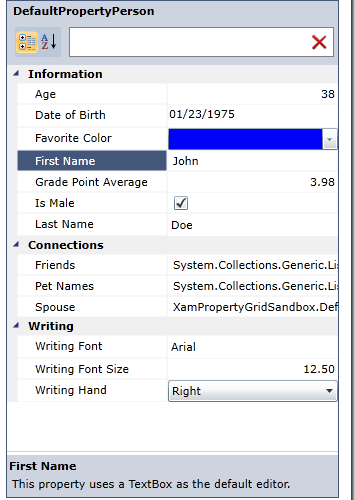
The XamProperty supports the System.ComponentModel.DefaultPropertyAttribute. By decorating a class with the DefaultPropertyAttribute, the decorated property will be automatically selected when the object is loaded.
publicclassDefaultPropertyPerson : INotifyPropertyChanged
{
string _firstName;
[Display(Name = “First Name”, GroupName = “Information”)]
[Description(“This property uses a TextBox as the default editor.”)]
publicstring FirstName
{
get { return _firstName; }
set
{
_firstName = value;
NotifyPropertyChanged(“FirstName”);
}
}
}

Expandable Properties
Sometimes it is necessary to show the properties of a complex object. The XamPropertyGrid supports this scenario and allows you to drill down into a property’s hierarchy. To enable this behavior you must decorate your property with the Infragistics.ComponentModel.DataAnnotations.ExpandableObjectAttribute.
[Display(Name = “Spouse”, GroupName = “Connections”)]
[Description(“This property is a complex property and has no default editor.”)]
[ExpandableObject]
publicExpandablePerson Spouse
{
get { return _spouse; }
set
{
_spouse = value;
NotifyPropertyChanged(“Spouse”);
}
}

What I know is missing
As awesome and feature rich as this new XamPropertyGrid control is, it still has a long ways to go before it is ready for prime time use in your applications. Heck, I only spent 5 days on it so far! Here are some features that I know are missing.
- Support for multiple objects
- Support for a custom category order
- Support for a custom property order (child properties as well)
- Support for ICustomTypeDescriptor
- Various events
- Virtualization
Getting Started
Getting started with this new control is very simple.
1. Download the CTP bits. Be sure to unblock the zip before extracting by right clicking the file and clicking Properties. The ZIP will contain DLLs for both WPF and Silverlight as well as a sample browser for each platform.

2. Create a new WPF or Silverlight Application
3. The XamPropertyGrid relies on several editors from the NetAdvantage product. Add the following references to your application (SL – 13.1.20131.2104 & WPF – 13.1.20131.2108):
- Infragistics(SL5/WPF4).Controls.Editors.XamCalendar.v13.1
- Infragistics(SL5/WPF4).Controls.Editors.XamColorPicker.v13.1
- Infragistics(SL5/WPF4).Controls.Editors.XamComboEditor.v13.1
- Infragistics(SL5/WPF4).Controls.Editors.XamDateTimeInput.v13.1
- Infragistics(SL5/WPF4).Controls.Editors.XamMaskedInput.v13.1
- Infragistics(SL5/WPF4).Controls.Editors.XamSlider.v13.1
- Infragistics(SL5/WPF4).v13.1
- InfragisticsWPF4.DataManager.v13.1(WPF only)
- Infragistics(SL5/WPF4).Controls.Editors.XamPropertyGrid.v13.1 (included in download)
- Infragistics.ComponentModel (included in download)
- System.ComponentModel.DataAnnotations
- System.Windows.Controls
4. Add the following namespace to the top of your view:
5. Add and instance of the XamPropertyGrid to you view and set the SelectedObject property to the instance of the object you want to edit:
SelectedObject=”{Binding Person}“></ig:XamPropertyGrid>
6. For Silverlight applications only; if you are using the Type property on an EditorDefinition, then you must use the Type markup extension provided by Infragistics.
Add the following namespaces to your view:
xmlns:sys=”clr-namespace:System;assembly=mscorlib”
And use it like this:
Conclusion
I think I have covered most of what you need to get started using the new XamPropertyGrid control. If you have any questions or feedback, please leave it in the comments section below. This is not supported by our forums or by our support staff (yet). I wanted to get this in your hands as fast as possible, and that meant cutting corners, ducking under the red tape, and climbing the barbed wire security fence. I really want to RTM this control by the 13.2 release (October-ish) time frame. Very soon, I will have a place for you to put all your feedback and feature requests. Until then, report all issues and feature requests here in this blog post. Remember, this is a CTP. Meaning that by the time this actually releases (RTM), the API will have changes, features may go away or change in their implementation, or we flat our remove the control from our plans. That’s why your feedback is so important in this very early stage of the control. Do you even want this control? Let me know what you think.


Hello,
I’ve tried to follow your example, but I have only Infragistics 14.1 installed and the xamPropertyGrid seems not to be available within 14.1 or as 14.1 CTP version. Has it been discontinued or is the control coming in the next release?
Sorry for the late reply, I have been traveling. This control has been added to the product and will be released next month with our 14.2 release.