Shhhh… Do you hear that? That’s the sound of another mind blowing, face melting, feature packed, Chuck Norris* approved release of Infragistics WPF and Silverlight controls. That’s right kiddies, this 13.2 release brings a number of new controls, new features, new themes, new styles, and much needed updates to an already industry leading WPF and Silverlight control suite. Let’s stop wasting time and get to what’s new!
XamRichTextEditor
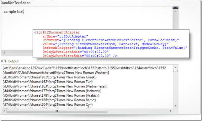
You’ve been asking, we’ve been listening, and now your wait is over. I am excited to announce our brand new xamRichTextEditor control, which is a highly customizable rich text editing control that provides functionality modeled after the features and behavior of Microsoft Word. So imagine taking Microsoft Word, removing all the crap you don’t care about or need, and then making a control out of it. Well, that’s exactly what we did. Even though this is a v1 release, it is packed with features.
Formatting Options
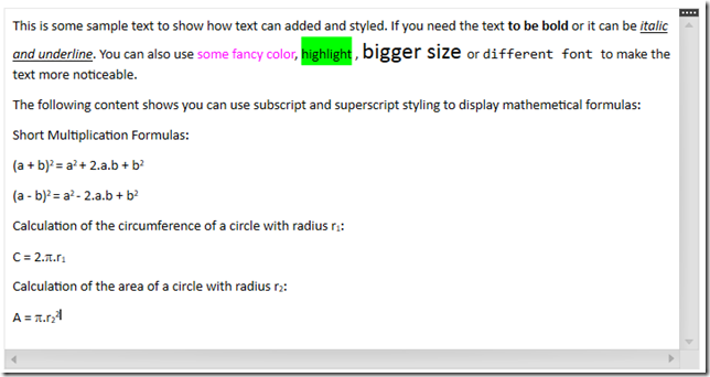
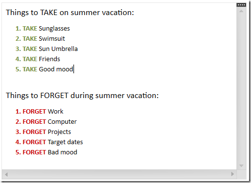
What formatting options do we have? More like, what formatting options don’t we have! The XamRichTextEditor has support for a number of text formatting options; such as font styles (bold, italic, underline, strikethrough), font name, font size, superscript and subscript, foreground and background colors, paragraph alignment (left, center, right, justify) and indention, as well as multi-level bulleted and numbered lists.
Not happy with the built in bullet and numbered lists options? Why don’t you use your own? You can easily create custom lists to meet your application requirements. You don’t need to settle for the default options.
Image Support
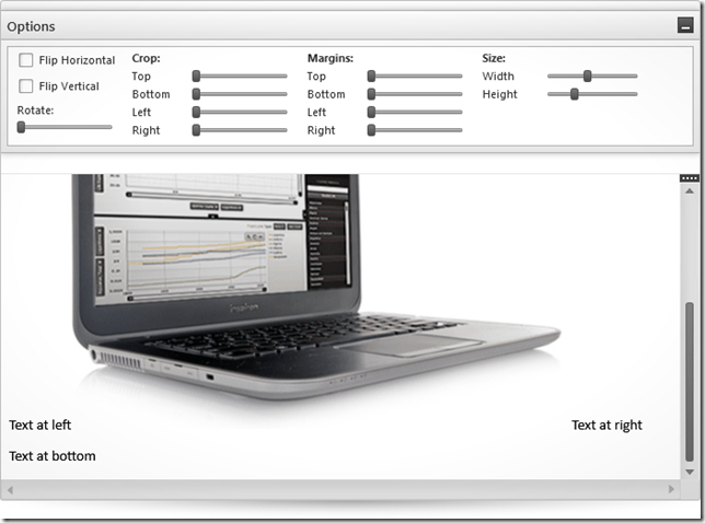
What about image support? Well, we got that too. The xamRichTextEditor not only has support for inserting and displaying images, but you can even flip the image horizontally or vertically, crop it, set margins, resize it, and even rotate it.
Table Support
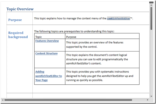
You need tables? Yeah, we got tables! If you want, you can even have tables, inside of tables, insides of tables. That’s a lot of tables.
MVVM Support
What’s that you say? What about MVVM support? Don’t you worry, we have your MVVM needs covered. You can easily data bind your rich text from a property in your ViewModel to the xamRichTextEditor by using one of the DocumentAdapters we have available. Choose from RTF, plain text, and DOCX. Don’t think you’re limited to just one DocumentAdapter per xamRichTextEditor control. Feel free to data bind to multiple formats using all three DocumentAdapers on a single xamRichTextEditor instance. Not only do we provide data binding to VewModels, but we also provide built-in support for over 34 commands that you can data bind to your buttons to apply many of the formatting options to the target xamRichTextEditor control’s content.
And More…
We even have a number of great editor customizations such as view splitting, zooming, capability to show hidden symbols, control over the caret color, control over the text update mode such as insert or overwrite, and more. Need to export the content? No problem! The xamRichTextEditor supports importing and exporting to/from RTF, DOCX, and plain text formats. We also provide an extensible API that allows you to provide support for other custom formats.
Alight Brian, but what about hyperlinks, undo and redo, multiple selection, tab stops, find and replace, clipboard support, and drop caps? Yes, yes, yes, yes, yes, yes, and YES! It has all of those features and more. As you can see, this control is packed with features. Don’t even get me going on the xamRichTextEditor’s performance. I challenge you to find a WPF and Silverlight rich text control with better performance!
The xamRichTextEditor is provided in both WPF and Silverlight versions with an API that is common across both platforms, enabling you to incorporate all of these great rich text editing capabilities into your cross platform applications.
XamBulletGraph
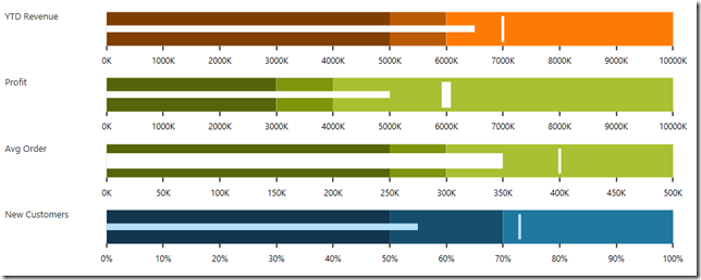
Our next brand new control to make its way into our WPF and Silverlight offering is the highly requested xamBulletGraph. Linear by design, it provides a simple and concise view of a primary measure, or measures, compared against a scale and, optionally, some other measure. The xamBulletGraph control provides you with the ability to create attractive data presentations, replacing meters and gauges that are used on dashboards, with simple, yet straightforward and clear bar charts. A bullet graph is one of the most effective and efficient ways to present progress towards goals, good/better/best ranges, or compare multiple measurements in as little horizontal or vertical space as possible.
Need your bullet graph to display vertically? No problem, the xamBulletGraph has configuration options to orient it either horizontal or vertical. Need control over the visual elements of the xamBulletGraph? We got you covered! You have complete control over the performance bar, comparative marker, ranges, tick marks, scale, labels, border, background, titles, and more. The xamBulletGraph has all the feature you would expect in a bullet graph control.
XamLinearGauge
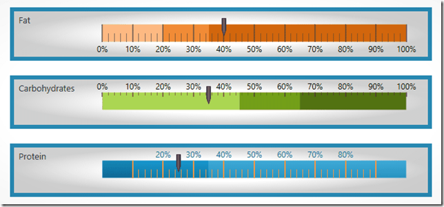
Now, you may be asking yourself, “don’t you already have a xamLinearGauge control”, and you are absolutely correct. Let me introduce you to the brand new version of our xamLinearGauge. This is a complete rewrite from the ground up. It has all the bells and whistle of the old version, but takes advantages of all of our lessons learned while writing the old one. We have improved the control API, usability, stability, and performance, as well as added new features and capabilities.
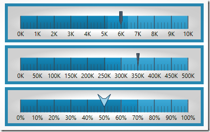
Change various attributes of the needle, including the needle color, length, shape. Use one of the predefined shapes – rectangle, triangle, needle, and trapezoid or create one of your own.
You have complete control over scale, including the start and end points, major and minor tick marks, labels, and color ranges. You can change its’ orientation from horizontal to vertical, as well as take advantage customized tooltips. With support for the Motion Framework, you can animate transitions between different configuration states and set the speed for those transitions.
This new xamLinearGauge will ultimately replace our previously released version. That means, from now on, you will want to use this new xamLinearGauges, and if you’re upgrading, you will want to start switching all the old linear gauges to use this new one. The new xamLinearGauge API is not backwards compatible with the legacy linear gauge.
XamRadialGauge
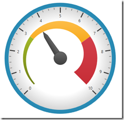
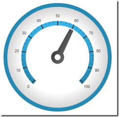
Yup, that’s right. We have written a brand new version of the xamRadialGauge control, which replaces the older version.
You control the Start and End positions of the scale, major and minor tick marks, labels, color ranges and sweep direction. You can create full 360 degree scales, or half circular gauges with 180 degree scales, 90 degrees, 45 degrees or any custom value you want.
Feel free to customize various attributes of the needle, including the needle color, length, point, base, and cap to fit your application needs. The following needle shapes are built-in; None, Rectangle, Triangle, Needle, Trapezoid, Rectangle With Bulb, Triangle With Bulb, Needle With Bulb, and Trapezoid With Bulb.
The xamRadialGauge control also has Motion Framework support built right into the control. You can easily animate transitions between different configuration states. The control gradually animates as it redraws changes to the needle, needle position, scale range, color range and more. You can control the speed of the animations by setting the desired Transition Duration.
Same story here. This new xamRadialGauge replaces the existing xamRadialGauge that was previously released. The APIs are not compatible, so you should start using this new xamRadialGauge, and migrating your existing radial gauges over to this new version.
XamDataChart Updates
We heard you loud and clear! We gave our industry leading xamDataChart control some much needed love as well. The xamDataChart is a real work horse, capable of displaying millions of data points in real-time with refresh rates measured in just a few milliseconds, and we spent a lot of time implementing a little “fit, finish, and polish” to our xamDataChart to make it even more feature rich and visual stunning.
Chart Title and Subtitle
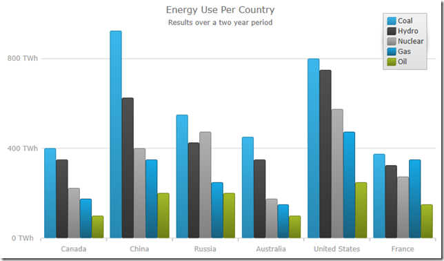
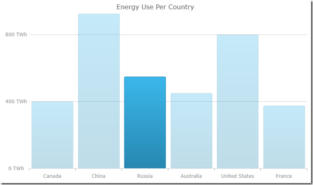
The title and subtitle feature of the xamDataChart control allows you to add information to the top section of the chart control. When adding a title and/or subtitle to the chart control, the content of the chart is automatically resized to allow for the title and/or subtitle information.
Axis Titles
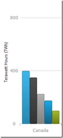
The axis title feature of the xamDataChart control allows you to add contextual information to the x-axis and y-axis of the xamDataChart control. You can customize the axis title by specifying properties of the TitleSettings object such as the angle, font size and position.
Series Highlighting
This feature allows you to highlight an entire series or individual items within the series. For example, highlights the entire line in a series such as the LineSeries as it is all one shape; however, highlights can be applied to each individual column in a series such as ColumnSeries. Individual markers can be highlighted in all supported series.
Drop Shadows
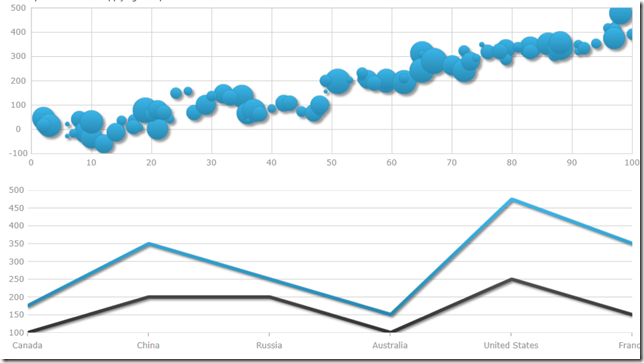
The xamDataChart now supports drop shadows to enhance the visuals of individual series. Developers can control various properties such as the shadow depth/offset/direction, color, and blur.
New Default Style
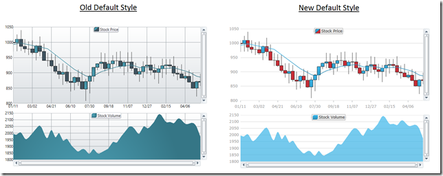
We heard a lot of feedback regarding the xamDataChart’s default look and feel when dragging it from the Visual Studio toolbox onto the design surface, and we made sure to improve your experience. You no longer have to spend hours setting properties, modify a control template, or creating new styles altogether. We spent a lot of time creating a new default style to make the xamDataChart kick you in the eyeballs with visual awesomeness. As of now, we are shipping it as a separate style that you can apply to your application. In a future release, and after we gather some feedback on our changes, we will officially make it the new default style, and you will never again see those old blue and gray scale colors. So if you like what we’ve done, you have to let us know!
And More…
We added a lot of other great features and improvements such as startup animations, nicely styled default tooltips, performance improvements, and more. There are so many xamDataChart features I could talk about, that a single blog post can’t do it justice.
XamGeographicMap Updates
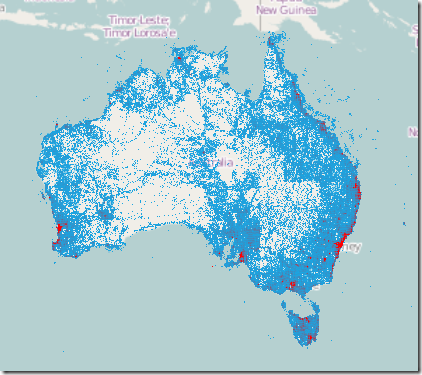
We updated our high performance xamGeographicMap control to include a new High Density Geographic Scatter Series. A High Density Geographic Scatter Series can be used to show millions of data points without sacrificing performance. The map plot area with more densely populated data points are represented by condensed color pixels, and loosely distributed data points are represented by pixels of another color. Options are available to control the palette of colors used and to change the min/max heat properties of the series in order to adjust how heat colors are mapped.
XamPieChart and XamDoughnutChart Updates
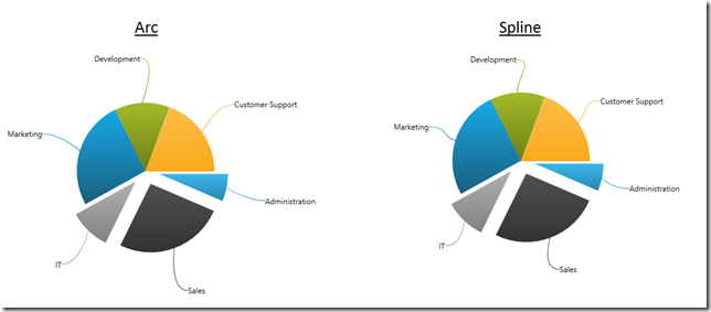
We made a nice improvement to both our xamPieChart and our xamDoughnutChart which allows you to add curves to your labeling callout lines. You can now add two types of curves to the straight lines used for the callout lines in the xamDoughnutChart and xamPieChart. You may choose whether to use a straight line or one of the curves, change the line style and control the spacing between the label and the end of the line.
New Metro Dark Theme
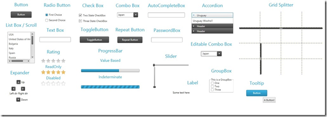
Our popular Metro theme just got a lot better. The Metro theme, which is a clean, modern, and touch friendly theme inspired by Microsoft’s Design Style has just received a new Dark version. The Dark version helps to reduce eye string that can happen when staring at screens for many hours with lighter themes. Honestly, it just looks cool!
Themes for Microsoft Controls
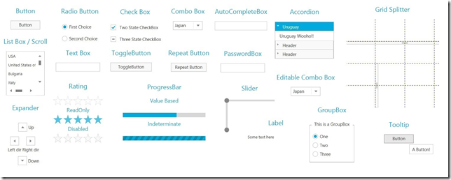
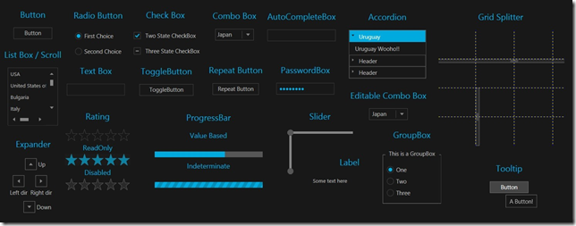
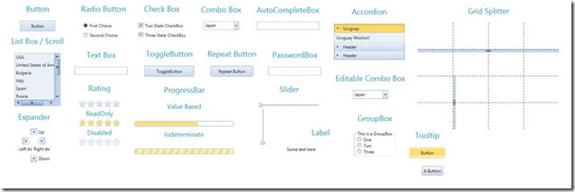
The IG, Offfice 2010, and Metro themes now have support for over 19 standard Microsoft WPF and Silverlight controls. Your application will no longer look like a Frankenstein of different styles. Now, your application’s UI will seamlessly integrate with the full range of Infragistics WPF and Silverlight controls.
IG Theme
Metro Light and Dark Themes
Office 2010 Blue Theme
Radial Menu (CTP)
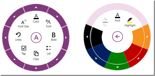
Even though this release was already packed with a ton of great controls and features, we managed to squeeze in one more new control. Inspired by the Microsoft OneNote radial menu, the xamRadialMenu provides a circular menu that orients the commands around the user, rather than requiring the user to negotiate a nested hierarchy of drop downs. Most commonly used as a context menu, the xamRadialMenu allows you to drill down into related sub-menu items with the ability to navigate back to the main level menu item. Although the xamRadialMenu is optimized for touch, it works just as well for mouse and keyboard interactions.
Although this is being released as a CTP control, it is package with functionality. It’s has configuration options for setting the number of wedges, rotation, size, and more. It has a number of built in tools such as a radio button, color well, numeric items and gauges, as well as a list tool. With support for recent items, tooltips, key tips, keyboard navigation, MVVM support, this control has everything you need to build your own touch based applications.
Let’s Wrap This Baby Up!
This release of Infragistics WPF and Silverlight 13.2 is packed full of new controls, new features, new themes, new styles, and much needed updates. This is a massive release! I couldn’t even cover every new feature. There is just way too many of them. I hope you are as excited about this release as I am. We worked hard to bring you the best controls available, and we continue to make investments into the controls you need the most.
As you have probably noticed, things are changing at Infragistics, and your voice is louder than ever. If you have ideas about new features we should bring to our controls, important issues we need to fix, or even brand new controls you’d like us to introduce, please let us know by posting them on our Product Ideas website. Follow and engage with us on Twitter via @infragistics. You can also follow and contact me directly on Twitter at @brianlagunas. Also make sure to connect with our various teams via our Community Forms where you can interact with Infragistics engineers and other customers.
If you are not using our WPF or Silverlight controls yet, remember that a free evaluation download is only a click away.
Lastly, when you do build something cool with our controls, please make sure to let us know.
*Chuck Norris is not affiliated with Infragistics and did not officially approve this release. This was simply a reference to how awesome this release is.

