A new version of the Extended WPF Toolkit has just released. In this release there are three new controls and updates have been to two existing controls. Lets take a look at what’s inside this newest release.
Updated Controls
The ColorPicker
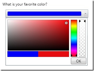
At first glance (see before picture) it looks like it has the functionality needed to choose colors, it even looks nice. Your user can even change the transparency of the color by using the alpha slider. Just what your users need right?
Well, after some very good feedback, it seems that users don’t like constantly searching for the same color. Actually, even if they could manage to get close to the same color, it will most likely not be the exact same color. It can also be time consuming to find the right color, you have to change the hue, then move the pointer around on the canvas, and then change the transparency if needed.
It is because of these usability issues that I have completely redesigned the control
Before:
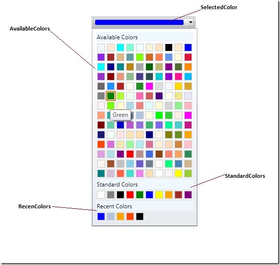
After:
By default, there are 140 available colors and 10 predefined standard colors. You can use your own custom color palettes by setting the AvailableColors and StandardColors properties accordingly. You can also get/set the recently used colors by using the RecentColors property.
The RichTextBoxFormatBar
Nothing major here in terms of design, but I have added support for numbered and bulleted lists, and for changing the text highlight and font colors.
Before:
After:
New Controls:
The DateTimeUpDown
The DateTimeUpDown control allows a user to increment or decrement a DateTime using button spinners, up/down keys, or the mouse wheel.
To increment or decrement the DateTime value, simply select the DateTime part you wish to modify and then interact with either the mouse wheel, spinner buttons, or updown arrow keys. The following image shows what the different DateTime parts look like when you select them.
Formats:
Depending on your DateTimeUpDown.Format, you may or may not have all DateTime parts available. You can also get the formatted DateTimeUpDown.Value by using the DateTimeUpDown.Text property.
| Format | Example |
| FullDateTime | |
| LongDate | |
| LongTime | |
| MonthDay | |
| RFC1123 | |
| ShortDate | |
| ShortTime | |
| SortableDateTime | |
| UniversalSortableDateTime | |
| YearMonth |
No custom formats yet, but I will be working on that for the next release.
The Magnifier
The Magnifier control does exactly what is sounds like. It allows a user to magnify parts of an application.
You can add the Magnifier to any element that is of type UIElement.
The MaskedTextBox
The MaskedTextBox control lets you display and edit values based on a mask. The mask is specified via its Mask property. To add a mask to the MaskTextBox set the MaskedTextBox.Mask property to a supported mask string.
<toolkit:MaskedTextBox Mask="(000) 000-0000" />
Checkout the documentation to view the list of supported mask strings.
Well that’s about it, beside some much needed bug fixes. So please go download the newest bits and start using these great new controls in your WPF applications. Oh, and don’t forget to provide feedback and report any issues you run into.


