So you want to use a Ribbon toolbar similar to Microsoft Word in your applications, but you don’t want to purchase one from a third party. Well if you haven’t heard already, you can get a free one directly from Microsoft. Yes, you heard me correctly, FREE, and FROM MICROSOFT. So where do you get this free Ribbon control?
To get it just follow these steps:
- Go to http://msdn.microsoft.com/officeui
- Click on “License the Office UI”
- Login using you Windows Live ID. If you don’t have one you can create one for free.
- Read and accept the Office UI License
- Click on the WPF Ribbon download button
- Accept the WPF Ribbon CTP License and follow the instructions to save the ribbon binaries to your computer.
Now that you have the Ribbon, you will notice there isn’t a lot of documentation. So how do you use this thing? Well lets start with the basics.
Adding the WPF Ribbon Control:
The first thing you need to do is add a reference to the RibbonControlsLibrary to your project. Next add the namespace declaration to your XAML.
<xmlns:r="clr-namespace:Microsoft.Windows.Controls.Ribbon;assembly=RibbonControlsLibrary“ />
Now that you have that done you can add the Ribbon control like so.
<DockPanel LastChildFill="True">
<r:Ribbon DockPanel.Dock="Top">
</r:Ribbon>
</DockPanel>
I personally like to place it DockPanel and dock it to the top. So this is what you should have so far. I know it is not much to look at right now, but we will fix that.
Adding the Application Menu:
Now that we have a Ribbon control we can start setting up our Application Menu. In Microsoft Word, this is the big round button in the top left corner of the application.
<r:Ribbon.ApplicationMenu>
<r:RibbonApplicationMenu>
<r:RibbonApplicationMenuItem />
</r:RibbonApplicationMenu>
</r:Ribbon.ApplicationMenu>
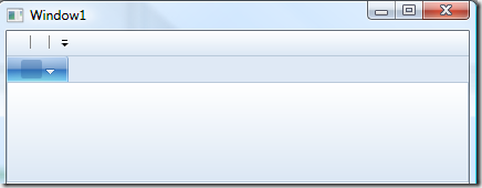
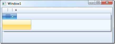
The above XAML will produce this:
I know what your thinking. What the hell is that? How do I set my text? How do I set my icon? All I see is an empty box. Enter the RibbonCommand. RibbonCommands allow you to define a ribbon element’s UI and reuse it at will. So how do you set one up? Let me show you.
<r:Ribbon.Resources>
<r:RibbonCommand x:Key="cmdAddNew"
Executed="OnAddNew_Executed"
LabelTitle="New Project"
LabelDescription="Creates an empty project."
LargeImageSource="Images/Large/New32.png"
SmallImageSource="Images/Small/New16.png"/>
</r:Ribbon.Resources>
Now we set the Command attribute on our element.
<r:Ribbon.ApplicationMenu>
<r:RibbonApplicationMenu>
<r:RibbonApplicationMenuItem Command="{StaticResource cmdAddNew}"/>
</r:RibbonApplicationMenu>
</r:Ribbon.ApplicationMenu>
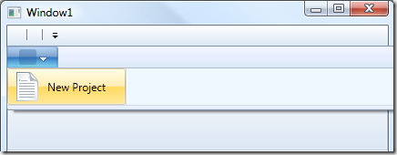
And BAM! You now have your icons and text. One thing to mention is that if you do not specify an Executed event, your button will be disabled until you do so.
Adding the Quick Access Toolbar:
The Quick Access Toolbar, also known as the QAT, is the mini menu that is normally at the top of the application just to the right of the application menu and includes a Customize Menu which end-users can use to add and remove buttons from the QAT. So how do we add one? Like so….
<r:Ribbon.QuickAccessToolBar>
<r:RibbonQuickAccessToolBar>
<r:RibbonButton Command="{StaticResource cmdAddNew}“ r:RibbonQuickAccessToolBar.Placement="InCustomizeMenuAndToolBar" />
</r:RibbonQuickAccessToolBar>
</r:Ribbon.QuickAccessToolBar>
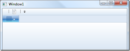
Remember that RibbonCommand we created earlier, well here it is again. Now you should have something like this:
See our new little icon at the top of the screen? Pretty isn’t it? Okay, not really, but it will be when we get finished with it.
Adding Tabs:
Okay this is really easy.
<r:RibbonTab Label="Home">
</r:RibbonTab>
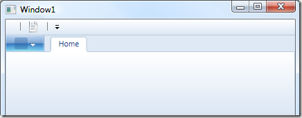
Thats it! Now you should have this:
Adding Groups:
These are just as easy.
<r:RibbonGroup>
<r:RibbonGroup.Command>
<r:RibbonCommand LabelTitle="File" />
</r:RibbonGroup.Command>
<r:RibbonButton Command="{StaticResource cmdAddNew}"/>
</r:RibbonGroup>
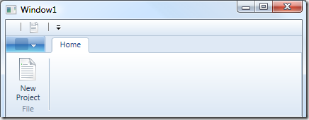
Make sure this code snippet goes inside the Tab you created.
Also, a little caveat, or word of caution, you cannot have an empty group. If you do, then you will get a compile error. So make sure you have at least one control inside of your group definition.
Styling the WPF Ribbon:
Okay, I admit, our ribbon is still butt ugly. So lets go ahead and fix this. There are a couple of different ways we can style our ribbon. We could custom write a resource dictionary and manually set all the style attributes to get the look we want. Or we can just use a supplied Office 2007 theme by using the PopularApplicationSkins class that is included with the RibbonControlsLibrary.dll.
In code behind you would do something like this:
Resources.MergedDictionaries.Add(Microsoft.Windows.Controls.Ribbon.PopularApplicationSkins.Office2007Blue);
In XAML it would look like this:
<Window.Resources>
<ResourceDictionary>
<ResourceDictionary.MergedDictionaries>
<ResourceDictionary Source="/RibbonControlsLibrary;component/Themes/Office2007Blue.xaml" />
</ResourceDictionary.MergedDictionaries>
</ResourceDictionary>
</Window.Resources>
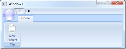
Either way our application is now looking good and ready to roll.
I hope this gets you going in the right direction. I plan on posting more advanced topics dealing with the ribbon in the future such as using the RibbonWindow, populating the “Most Recent Items List”, and using a Dialog Launcher. If you have any requests please feel free to ask.



Nice tutorial.
Just wanted to know why didn’t you use the r:RibbonWindow instead of the vanilla Window ?
@Tushar
Because, at the time of this post, the RibbonWindow did not render properly in Vista. I have not tried it in Windows 7 yet, but I am guessing the rendering problem will still exist.