Try to think of your top three movie sequels. Which ones come to mind? Having trouble? Well, that might be because it’s not often that you find a sequel that is just as good, if not better, than the first. Well, grab your popcorn, your drinks, and your candy, because this 14.2 release of Infragistics WPF controls is the MUST SEE sequel of the year! In just a mere six months, we have RTM’d the xamDiagram and xamSpreadsheet controls, created a new property grid control, innovated a new theme manager, added unrivaled MVVM support, improved our APIs, added tons of other features to a number of existing controls, and even had time to write two new sample applications. If this 14.2 release was a movie, it would win an Oscar in the “Best Release Ever” category.
I would like to remind you that this year we are focusing on three main areas, all designed to help you deliver the best, most modern applications to your customers faster than ever.
- Touch everywhere, Office inspired apps on every platform
- Deliver Outstanding Experiences with Awesome Branding and Styling
- Developer productivity across every device, and every platform
This isn’t just limited to our WPF controls. We are focused in these three areas across desktop, responsive web, and native mobile toolsets. Everything we are doing in each product is going to circle back to one of these areas, and of course some features overlap. I would like to also mention, that every single one of these new controls and features we are releasing in 14.2 were asked for by you. You told us what you wanted, and we delivered. This is your release, AGAIN! Have you noticed a pattern yet?
Touch Everywhere, Office Inspired Apps on Every Platform
xamDiagram
In our 14.1 release earlier this year, you had a chance to preview the xamDiagram as a CTP (Community Technology Preview) control. This gave you time to play around with the control early in its development, and the ability to provide feedback on how the control should work. Well, we heard your feedback loud and clear, and those of you that provided us feedback will see your ideas built directly into the control. Now you can tell all of your friends, family, and coworkers, “See that feature there? That was my idea!”.
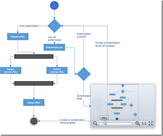
Besides having support for over 16 predefined shapes, connections with 7 types of line styles and 28 types of connection end caps, and a built-in toolbox that allows you simply drag and drop a shape of your choice onto the xamDiagram, we now have full support for MVVM friendly data binding. In fact, the xamDiagram has the most powerful, highest performing, and flexible data binding support available. Period!
xamSpreadsheet
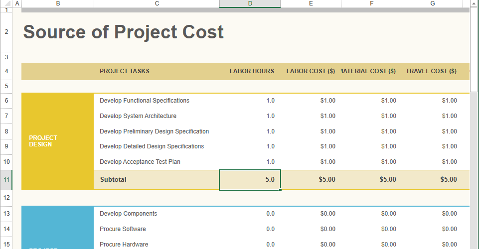
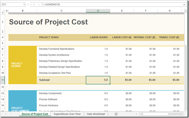
It’s official! The xamSpreadsheet has shed its CTP label and is ready for prime time. In case you missed it, the xamSpreadsheet is a Microsoft Excel inspired control that gives you the ability to embed Excel document creation and editing experiences into your WPF applications. The xamSpreadsheet is built on top of our existing Excel Framework, and provides an interactive control to our already powerful Excel document capabilities. With powerful editing and cell formatting features, the xamSpreadsheet brings the familiarity of Excel into your customer’s apps.
xamPropertyGrid
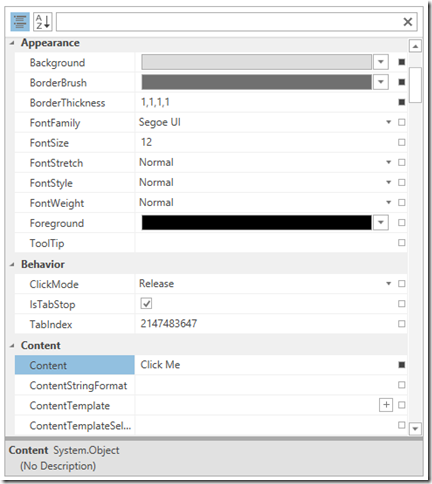
The xamPropertyGrid brings the power of Visual Studio’s property grid control into your WPF applications and lets you browse, view, and edit the properties of one or more objects. As you may know, I have been trying to get a property grid in the product for a while now. I even went as far as writing my own prototype and releasing it on my blog. Well, we finally got it!
The xamPropertyGrid support inspecting one or more objects simultaneously. Simply bind the object to the SelectedObject property, or SelectedObjects if dealing with multiple objects, and the xamPropertyGrid will automatically display that object’s properties, which can then be viewed and edited. For complex properties (properties that have nested/sub properties) the xamPropertyGrid allows you to expand and drill into the object to edit the nested property values. All changes made to a property’s value in the xamPropertyGrid will be reflect back into the bound object(s).
The xamPropertyGrid has a number of standard editors that are automatically used depending on the data type of the property. For example, if the data type of the property is a Boolean, then the CheckBox editor will be used; if the data type is an enum, then a ComboBox will be used as an editor. The xamPropertyGrid also has a Brush editor for editing complex brushes and gradients, as well as a collection editor which allows you to add and remove objects from a collection. You can even provide custom editors base on a property type, or even a property name.
For generating properties you have two options. The ReflectionPropertyGenerator, which uses reflection to discover and generate the properties of an object, and the TypeDescriptorPropertyGenerator which uses TypeDescriptor to generate the properties of an object. You can also provide item filters to create complex filtering conditions for the generated properties to control what properties are shown, or excluded, from the xamPropertyGrid.
Need attribute support? No problem. The xamPropertyGrid supports a number of built-in attributes that can be applied to a property or class to control various aspects of it’s display and/or behavior. The xamPropertyGrid supports the following attributes; BrowsableAttribute, CategoryAttribute, DisplayNameAttribute, DescriptionAttribute, DefaultValueAttribute, ReadOnlyAttribute, DefautPropertyAttribute, TypeConverterAttribute.
Deliver Outstanding Experiences with Awesome Branding and Styling
ThemeManager
Besides all the awesome new controls we are delivering with the 14.2 release, we are also releasing a brand new ThemeManager component that will greatly simplify applying themes and styles to your application. You can apply a theme to your entire application by using the ThemeManager.ApplicationTheme property, or you can apply a theme at the control level by using an attached property directly in XAML on the control you would like to apply the theme to. Our ThemeManager supports the most common Microsoft controls, meaning that not only will our ThemeManager control the theme of Infragistics controls, but it will also apply the theme to the Microsoft controls. There is a property on the Theme to turn off this support, just in case the you don’t want us to theme the standard Microsoft controls in your application. But really, who doesn’t want that?
Not happy with one of our themes? No problem, you can easily extend Infragistics existing themes by creating a class that derives from a built-in theme class, overriding the ConfigureControlMappings method, and adding custom resources that will be applied when the theme is used by the ThemeManager.
Or better yet, create your own custom theme. You can easily create custom themes by creating a class that derives from ThemeBase, implement the abstract ConfigureControlMappings method, and then provide the necessary resource dictionaries that should be used when applying the theme with the ThemeManager.
Developer Productivity across Every Device, Every Platform
xamDataGrid
The xamDataGrid has received a lot of love and improvements in its usability, API, and MVVM support. It has never been easier to use the xamDataGrid.
Probably the biggest improvement we made was the addition of field specific editors. This means you can now define a specific editor to use for a field, without having to create styles to set simple editor properties. For example, a you can declare a NumericField to represent a numeric editor for a property, and then set the properties of the NumericField directly on the field level, removing the need to create a style. We also provide a binding markup extension called FieldBinding to simplify the binding syntax when using MVVM and binding field properties to properties in the underlying ViewModel. This greatly improves the usability of the xamDataGrid, greatly improves the discoverability of the API, and reduces the amount of code required to create a FieldLayout. The editor specific fields we provide include the CheckBoxField, ComboBoxField (this one is awesome), CurrencyField, DateTimeField, MaskedTextField, NumericField, and TextField.
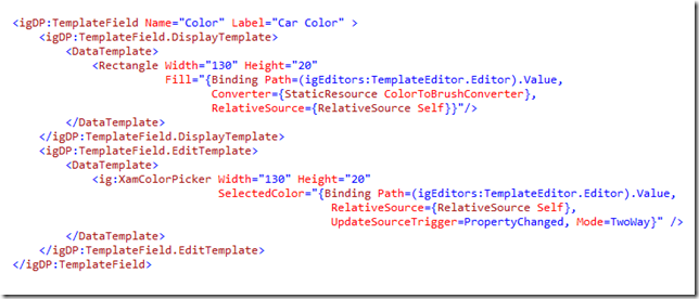
The next major addition to the xamDataGrid is the addition of the new TempateField object. You can now supply your own custom controls to use as an editor in the xamDataGrid. Using the new TemplateField, you simply provide a DisplayTemplate to represent the value in a viewing mode, and an EditTemplate to use when the cell is in edit mode. We provide a binding markup extension named TemplateEditorValueBinding to help create the binding between your custom control/template and the TemplateField’s editor host.
Next, we added some great data binding support to help enable your MVVM development techniques even more. We have added a new CellBindings property on the xamDataGrid field objects that allow you to data bind properties of the field editors to properties of the underlying data item. We provide the ability to bind directly to properties of the CellValuePresenter, or the properties of the cell editor, by exposing a Target property. This is huge addition to our MVVM support.
We also added some much needed properties to the field such as IsReadOnly, IsEnabled, and IsTabStop. We also spent a lot of effort simplifying the API of the field objects so that you no longer have to create a FieldSettings object to set the most commonly used properties of a field object.
xamDataTree
The xamDataTree is getting a new SelectedDataItems property which will allow you to data bind a collection of objects from your ViewModel directly to the xamDataTree to get and set the selected items in the UI. The xamDataTree is also getting a new IsSelectedMemberPath which will allow you to data bind the selection state of a tree node to a property of the underlying bound data item.
xamPivotGrid
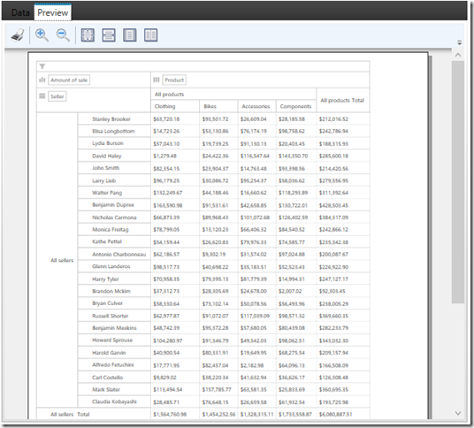
The xamPivotGrid now has support for printing. The new printing feature is based on the WPF Reporting framework and comes with built-in support for export to XPS. We ship a dedicated printing theme for best printing results. There are also options for customizing the printed grid such as headers repetition, overriding default cell styles, expansion indicators visibility, etc.
xamColorPicker
The behavior of the xamColorPicker has been changed. Before, the SelectedColor would be set if a user were to hover over a color with the mouse in the control. This caused the SelectedColorChanged event to fire multiple times, as well as caused the setters of the underlying data bound property to be called. We have change this behavior to only update the SelectedColor when a user clicks on a new color swatch in the control. To preserve the ability to provide a preview of the color that is hovered over in the control, we have added a new property called SelectedColorPreview. This property will be updated to the color that is currently hovered over with the mouse to give you the ability to access the color before it is set to the SelectedColor.
Let’s Wrap this Baby Up!
Besides all of the great controls and new features I mentioned in this post, we are delivering much more that I didn’t get a chance to talk about. We have tons of other smaller features, and bug fixes, and performance optimizations that we are part of our newest 14.2 release.
I hope you are as excited about this release as I am. As you have probably noticed, things are changing at Infragistics, and your voice is louder than ever. If you have ideas about new features we should bring to our controls, important issues we need to fix, or even brand new controls you’d like us to introduce, please let us know by posting them on our Product Ideas website. Follow and engage with us on Twitter via @infragistics. You can also follow and contact me directly on Twitter at @brianlagunas. Also make sure to connect with our various teams via our Community Forums where you can interact with Infragistics engineers and other customers.
If you are not using our WPF or Silverlight controls yet, remember that a free evaluation download is only a click away.
Lastly, when you do build something cool with our controls, please make sure to let us know.





Excellent work Brian. Love the new controls and enhancements. Especially the datagrid and combo updates.
Thanks Dan! I am probably more excited about the new xamDataGrid features than any of the others :0)