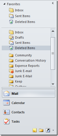
Most of you are aware of what an OutlookBar control is. For those of you who don’t, it is a navigation control that is probably most known for its use in Microsoft Outlook. In Microsoft Outlook, the Outlook Bar is the column on the left side of the Outlook window that contains groups of shortcuts. Users click a shortcut to open a frequently used item, such as their Inbox, calendar, or contacts.

So it’s not surprising that we at Infragistics have our own version of this control, the XamOutlookBar, that you can use in your own application. If you have used this control you already know how powerful the XamOutlookBar is. You can create custom navigation by adding your own groups declaratively through XAML, with each group having it’s own specialized amount of content. That is pretty cool, but did you know you can data bind not only the groups, but the content for the groups as well? That means that my entire navigation structure can be dynamically generated at run time.
Let’s take a look at how to data bind your collection of objects to the XamOutlookBar to generate your groups and navigation. First I need my data. I have two objects. One representing the Group and another that will represent my menu items that will be within the group.
{
public string Title { get; set; }
public string LargeImagePath { get; set; }
public string SmallImagePath { get; set; }
public ObservableCollection<MenuItem> Items { get; set; }
public Group()
{
Items = new ObservableCollection<MenuItem>();
}
}
{
public bool IsExpanded { get; set; }
public string Title { get; set; }
public ObservableCollection<MenuItem> Children { get; set; }
public string ImagePath { get; set; }
public MenuItem()
{
Children = new ObservableCollection<MenuItem>();
}
}
As you can see these are very simple POCO objects. The Group class has properties for the group title, the large and small image paths, and a collection of menu items. The MenuItem class has properties to control the expanded state, the title of the menu item, an image path, and a collection of child menu items. This will allow us to have a hierarchical navigation structure to the n-level. I would like to mention that none of the classes implement INotifyPropertyChanged. This is because for this simple demo I do not need property changed notification. Chances are, that in a production application you may be modifying the properties at run time, so I would recommend implementing the INotifyPropertyChanged interface on your navigation objects.
Next I need a ViewModel. This ViewModel will be responsible for creating my Group/Menu structure for use in data binding to the XamOutlookBar.
{
private ObservableCollection<Group> _groups;
public ObservableCollection<Group> Groups
{
get { return _groups; }
set
{
_groups = value;
OnPropertyChanged(“Groups”);
}
}
public ViewModel()
{
Groups = GenerateGroups();
}
private ObservableCollection<Group> GenerateGroups()
{
ObservableCollection<Group> groups = new ObservableCollection<Group>();
//create the mail group with menu items
var mailGroup = new Group() { Title = “Mail”,
LargeImagePath = @”/XamOutlookBarDataBinding;component/Images/Mail32.png”,
SmallImagePath = @”/XamOutlookBarDataBinding;component/Images/Mail16.png” };
var rootMailItem = new MenuItem() { Title = “Personal Folders”, IsExpanded = true };
rootMailItem.Children.Add(new MenuItem() { Title = “Inbox”, ImagePath = @”/XamOutlookBarDataBinding;component/Images/InboxFolder16.png” });
rootMailItem.Children.Add(new MenuItem() { Title = “Drafts”, ImagePath = @”/XamOutlookBarDataBinding;component/Images/DraftsFolder16.png” });
rootMailItem.Children.Add(new MenuItem() { Title = “Sent Items”, ImagePath = @”/XamOutlookBarDataBinding;component/Images/SentFolder16.png” });
rootMailItem.Children.Add(new MenuItem() { Title = “Deleted Items”, ImagePath = @”/XamOutlookBarDataBinding;component/Images/DeletedFolder16.png” });
mailGroup.Items.Add(rootMailItem);
//create the contacts group with menu items
var contactsGroup = new Group() { Title = “Contacts”,
LargeImagePath = @”/XamOutlookBarDataBinding;component/Images/Contact32.png”,
SmallImagePath = @”/XamOutlookBarDataBinding;component/Images/Contact16.png” };
var rootContactItem = new MenuItem() { Title = “My Contacts”, IsExpanded = true };
rootContactItem.Children.Add(new MenuItem() { Title = “Suggested Contacts”, ImagePath = @”/XamOutlookBarDataBinding;component/Images/Contact16.png” });
rootContactItem.Children.Add(new MenuItem() { Title = “Contacts” , ImagePath = @”/XamOutlookBarDataBinding;component/Images/Contact16.png” });
contactsGroup.Items.Add(rootContactItem);
groups.Add(mailGroup);
groups.Add(contactsGroup);
return groups;
}
public event PropertyChangedEventHandler PropertyChanged;
protected void OnPropertyChanged(string propertyname)
{
var handler = PropertyChanged;
if (handler != null)
handler(this, new PropertyChangedEventArgs(propertyname));
}
}
As you can see, this class does implement INotifyPropertyChanged, as should all ViewModels. We have a single property called Groups which is a collection f our group objects. We have a method that is creating our navigation structure. Now this could come from an XML file, a database, or some other source that contains your navigation structure. My demo application also comes with some images that I will be using. Feel free to use them in your apps.
Now we need to hook up our data binding to our XamOutlookBar control. First we need to setup our View with some namespaces, a data context, and then XamOutlookBar.
xmlns=”http://schemas.microsoft.com/winfx/2006/xaml/presentation”
xmlns:x=”http://schemas.microsoft.com/winfx/2006/xaml”
xmlns:local=”clr-namespace:XamOutlookBarDataBinding”
xmlns:igWPF=”http://schemas.infragistics.com/xaml/wpf”
Title=”MainWindow” Height=”350″ Width=”225″ >
<Window.DataContext>
<local:ViewModel />
</Window.DataContext>
<Grid>
<igWPF:XamOutlookBar GroupsSource=”{Binding Groups}” />
</Grid>
</Window>
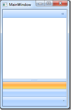
Here is our view. Notice that we are setting the DataContext of the View declaratively in XAML. We have a XamOutlookBar where we are data binding the GroupSource property to the Groups property that exists on our ViewModel. If you run the application you’re going to get this:

Well that doesn’t look right does it? That’s because we have to instruct the XamOutlookBar on how to handle our custom properties and display them properly. So we need to create a style.
<Style TargetType=”{x:Type igWPF:OutlookBarGroup}“>
<Setter Property=”Header” Value=”{Binding Title}“/>
<Setter Property=”LargeImage” Value=”{Binding LargeImagePath}“/>
<Setter Property=”SmallImage” Value=”{Binding SmallImagePath}“/>
</Style>
</Window.Resources>
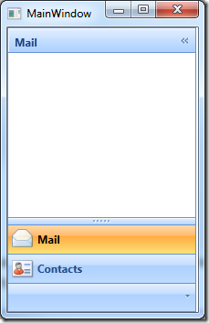
This Style is an implicit style targeting the OutlookBarGroup of the XamOurlookBar control. So for every OutlookBarGroup that is created, this style will be applied. As you can see we are simply mapping the Header to our Title property, and the large and small image of the OutlookBarGroup to our corresponding properties in our ViewModel.

That’s much better. Now we are getting somewhere. I can see each of my groups and its respective image. There is still something missing here. Where the heck is my menu items? Well, we need to tell the OutlookBarGroup how to handle that. So lets add some markup to our style.
<Setter Property=”Header” Value=”{Binding Title}“/>
<Setter Property=”LargeImage” Value=”{Binding LargeImagePath}“/>
<Setter Property=”SmallImage” Value=”{Binding SmallImagePath}“/>
<Setter Property=”Content” Value=”{Binding Items}” />
<Setter Property=”ContentTemplate”>
<Setter.Value>
<DataTemplate>
<ig:XamDataTree ItemsSource=”{Binding}“>
<ig:XamDataTree.GlobalNodeLayouts>
<ig:NodeLayout Key=”ItemsLayout” TargetTypeName=”MenuItem” DisplayMemberPath=”Title” IsExpandedMemberPath=”IsExpanded”>
<ig:NodeLayout.CollapsedIconTemplate>
<DataTemplate>
<Image Source=”{Binding Data.ImagePath}” />
</DataTemplate>
</ig:NodeLayout.CollapsedIconTemplate>
</ig:NodeLayout>
</ig:XamDataTree.GlobalNodeLayouts>
</ig:XamDataTree>
</DataTemplate>
</Setter.Value>
</Setter>
</Style>
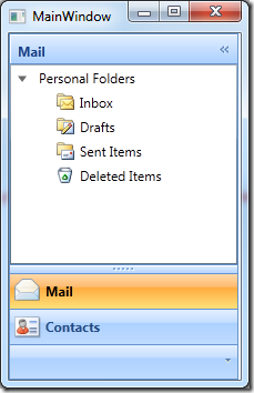
Okay, what the heck is all that stuff? Well first we data bind the Content property of the OutlookBarGroup to the Group.Items property of the Group POCO class. Now we need to instruct the OutlookBarGroup how to render that collection in the UI. So we simply set the OutlookBarGroup.ContentTemplate property to a new DataTemplate. In this case, I have chosen to use the XamDataTree to display my hierarchical navigation structure. We data bind the XamDataTree.ItemsSource to the current DataContext by simply defining “{Binding}”. Next we create a node layout the lets the XamDataTree know how to handle the incoming structure. Now with this completed style you should have the following result:

That’s it! You have now successfully data bound your XamOutlookBar to a collection of custom object to dynamically generate your application navigation. No too bad.
Be sure to download the source code and let me know if you have any questions. As always, you can reach me through the comments section or on Twitter (@brianlagunas).


