It’s that time again! Time for another free WPF and Silverlight theme for the Microsoft controls. The last free theme I gave away was the Metro Light and Dark Themes for WPF and Silverlight Microsoft controls. Soon after I released that theme, there was an overwhelming positive response from the community. So, I am fulfilling the promise I made in my last post. I am releasing another free theme.
Today’s free theme is the standard Infragistics Theme, also referred to as the IG Theme.
Silverlight
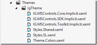
First up is the Silverlight version of the Infragistics’ “IG Theme”. We are providing a style for each primitive control that appears in the Visual Studio toolbox, the controls that ship with the Silverlight SDK, and of course some controls from the Silverlight Toolkit. As you can see, we organized the themes by their respective source so that you have the option to use which ever control you need and not add any unnecessary dependencies on other assemblies. Here is the list of resource dictionaries you are getting.

Adding the theme to your application is very simple. Just include the resource files for the controls you require the Resources section of your view, or in your App.xaml.
<ResourceDictionary Source=”Themes/IgTheme/IG.MSControls.Core.Implicit.xaml” />
<ResourceDictionary Source=”Themes/IgTheme/IG.MSControls.SDK.Implicit.xaml” />
<ResourceDictionary Source=”Themes/IgTheme/IG.MSControls.Toolkit.Implicit.xaml” />
</ResourceDictionary.MergedDictionaries>
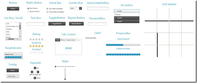
Here is the full list of supported Silverlight controls.
- Accordion
- AutoCompleteBox
- BusyIndicator
- Button
- CheckBox
- ComboBox
- Expander
- GridSplitter
- Label
- ListBox
- PasswordBox
- ProgressBar
- RadioButton
- Rating
- RepeatButton
- Slider
- TabControl
- TextBox
- ToggleButton
- Tooltip
WPF
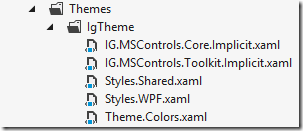
Next up is the WPF version of the Infragistics’ “IG Theme”. Just like the Silverlight version, we are providing you with styles for the primitive WPF controls that appear in the Visual Studio toolbox, as well as some controls in the WPF Toolkit. Just like for the Silverlight version, we organized the themes by their respective source so that if you don’t use the WPF toolkit, there will be no need for your code to take a dependency on it.

Adding the theme to your application is the same as the Silverlight version. Just add the resource dictionaries to the Resources section of your View or App.xaml.
<ResourceDictionary Source=”Themes/IgTheme/IG.MSControls.Core.Implicit.xaml” />
<ResourceDictionary Source=”Themes/IgTheme/IG.MSControls.Toolkit.Implicit.xaml” />
</ResourceDictionary.MergedDictionaries>
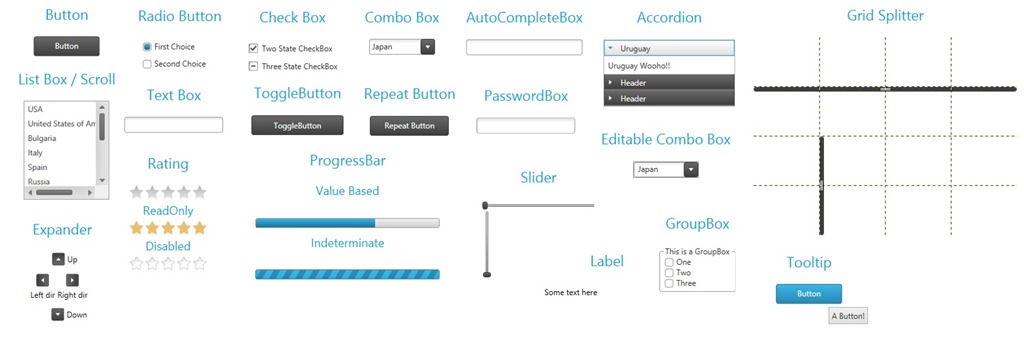
Here is the full list of support controls:
- Accordion
- AutoCompleteBox
- Button
- CheckBox
- ComboBox
- Expander
- GridSplitter
- GroupBox
- Label
- ListBox
- PasswordBox
- ProgressBar
- RadioButton
- Rating
- RepeatButton
- Slider
- TextBox
- ToggleButton
- Tooltip
That’s All Folks
I hope you enjoy this theme and find it useful. If you like this theme and want me to continue to give away our other themes (like the Office 2010 Blue theme), please let me know. Otherwise, I will just assume you’re not interested and move on to other things. Go ahead, download the Infragistics’ IG Theme for WPF and Silverlight Microsoft Controls and let me know what you think.
Install with NuGet
WPF Theme – https://www.nuget.org/packages/Infragistics.Themes.IG.Wpf/
Silverlight Theme – https://www.nuget.org/packages/Infragistics.Themes.IG.SL/
After you’ve done that, feel free contact me on my blog, connect with me on Twitter (@brianlagunas), or leave a comment below for any questions or comments you may have.


That look awesome! Downloading …
Thanks so much for all your efforts.
Hi,
I was explicitly setting the themes of Infragistic controls (xamRibbon, xamDockManager) that I am using in an application to “Metro”. To have the res of my app adopt the Metro theme, I downloaded your themes. All worked well except that I now have all controls except for the Infragistics displayed using the Metro theme. How do I get that nice blue background of the xamDockManager, for example, back?
Thanks for any advise.
These themes are only for the Microsoft controls. You should keep your original theme applied to the Infragistics controls.
[…] FREE IG Theme for WPF and Silverlight Microsoft Controls […]
[…] FREE IG Theme for WPF and Silverlight Microsoft Controls […]
wow!!! why didn’t I find these themes ( the office 2010 theme too!) sooner!? great werk!
Just Awesome!!!! Working perfectly. Finally got the right one for FREE after roaming like a hell all over the internet!