Quite some time ago, Josh Smith wrote a post on how to adorn the cells of the XamDataGrid. I like the concept, but wanted a better implementation that didn’t rely on events or initializing controls in the code behind. So this led me to write a simple cell adorner framework that will allow you to adorn a cell in the XamDataGrid/XamDataPresenter with any custom control. Now keep in mind, this was something I just coded up and didn’t take every usage scenario into consideration. If this doesn’t fit your needs feel free to modify the source code to accommodate your requirements.
The framework is made up of just a handful of classes:
- FieldAdorner.cs – a simple class that is used to associate an adorner with a field.
- FieldAdornerCollection.cs – a custom ObservableCollection<FieldAdorner> to maintain a list of adorners.
- FieldAdornerSettings.cs – this class does all the heavy lifting and is responsibly for the adorning behaviors
- UIElementAdorner.cs – an adorner base class that wraps the control being used as an adorner.
- XamDataPresenterFieldAdorner.cs / IXamDataPresenterFieldAdorner.cs – a custom control for you to derive from to simplify things. Don’t have to use it, but your control will at minimum require the IXamDataPresenterAdorner interface.
- XamDataPresenter.cs – a class that defines the attached property for the FieldAdornerSettings.
The Sample
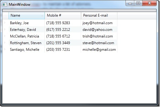
First lets start off by creating a simple application that contains a grid and a few rows of data. I will not bore you with all the code it takes to create it, but I will show you what my results are.
I do want to show you the XAML it takes to define the XamDataGrid.
<igDP:XamDataGrid.FieldLayouts>
<igDP:FieldLayout>
<igDP:FieldLayout.Fields>
<igDP:Field Name="DisplayName" Label="Name" />
<igDP:Field Name="CellPhone" Label="Mobile #" />
<igDP:Field Name="PersonalEmail" Label="Personal E-mail" />
</igDP:FieldLayout.Fields>
<igDP:FieldLayout.Settings>
<igDP:FieldLayoutSettings AutoGenerateFields="False" HighlightAlternateRecords="True" SelectionTypeCell="Single" SelectionTypeField="Single" SelectionTypeRecord="Single" />
</igDP:FieldLayout.Settings>
<igDP:FieldLayout.SortedFields>
<igDP:FieldSortDescription Direction="Ascending" FieldName="DisplayName" />
</igDP:FieldLayout.SortedFields>
</igDP:FieldLayout>
</igDP:XamDataGrid.FieldLayouts>
</igDP:XamDataGrid>
As you can see it’s nothing special. Just a XamDataGrid bound to some objects.
Create an Adorner Control
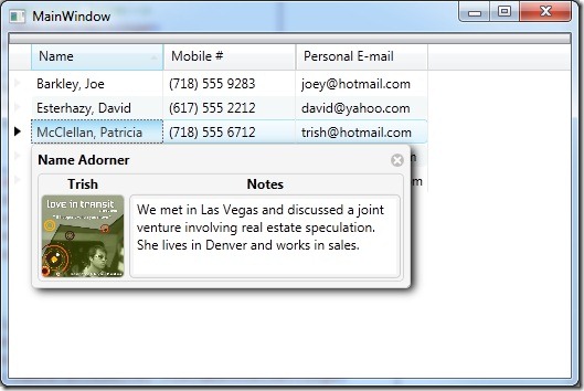
Before you can start adding adorners to your cells you must first have a control to use as an adorner. You have a couple of options to create your control. You can implement the IXamDataPresenterFieldAdorner interface or you can simply derive from the XamDataPresenterAdorner control. Let’s do it the easy way and just use the XamDataPresenterAdorner control. It does all the heavy lifting for us. Here is the adorner control for the DisplayName field.
xmlns="http://schemas.microsoft.com/winfx/2006/xaml/presentation"
xmlns:x="http://schemas.microsoft.com/winfx/2006/xaml"
xmlns:igExtension="clr-namespace:Infragistics.Extensions;assembly=Infragistics.Extensions"
Caption="Name Adorner" IsTabStop="True">
<Grid>
<Border Background="WhiteSmoke" BorderBrush="LightGray" BorderThickness="1" CornerRadius="4">
<Grid>
<Grid.RowDefinitions>
<RowDefinition Height="Auto" />
<RowDefinition Height="80" />
</Grid.RowDefinitions>
<Grid.ColumnDefinitions>
<ColumnDefinition Width="80" />
<ColumnDefinition Width="250" />
</Grid.ColumnDefinitions>
<TextBlock Grid.Row="0" Grid.Column="0" FontWeight="Bold" Text="{Binding Path=NickName, Mode=OneWay}" TextAlignment="Center" />
<Border Grid.Row="1" Grid.Column="0" BorderBrush="#88AAAAAA" BorderThickness="1" CornerRadius="4" HorizontalAlignment="Center" VerticalAlignment="Center" Width="76" Height="76">
<Border.Background>
<ImageBrush ImageSource="{Binding Path=ImageUri}" />
</Border.Background>
</Border>
<TextBlock Grid.Row="0" Grid.Column="1" FontWeight="Bold" HorizontalAlignment="Center" VerticalAlignment="Center" Text="Notes" />
<Border Grid.Row="1" Grid.Column="1" BorderBrush="#88AAAAAA" BorderThickness="1" CornerRadius="4" HorizontalAlignment="Center" VerticalAlignment="Center" Padding="3">
<TextBox x:Name="textBox" AcceptsReturn="True" BorderThickness="0" HorizontalAlignment="Center" VerticalAlignment="Center" MaxLines="10" Width="238" Height="68" Text="{Binding Path=Notes, UpdateSourceTrigger=PropertyChanged}" TextWrapping="Wrap"/>
</Border>
</Grid>
</Border>
</Grid>
</igExtension:XamDataPresenterFieldAdorner>
Notice how we are data binding to certain properties that will exist on the record. We can do this because the DataContext of the control will be set each time a new record is selected. The DataContext of the control will always be the data item of the selected row.
Here is the code behind:
{
public DisplayNameAdorner()
{
InitializeComponent();
}
protected override void OnGotFocus(System.Windows.RoutedEventArgs e)
{
base.OnGotFocus(e);
// This control's IsTabStop property is set to true,
// so when we are given focus, redirect it to the TextBox.
this.textBox.Focus();
this.textBox.SelectAll();
}
}
Notice we are setting focus to the TextBox when ever the adorner control gets focus. This will improve the user experience when tabbing through the cells and adorned cells.
Adding Cell Adorners
Now that we have the sample stuff out of the way, let’s get down and dirty. To start using the framework you must first add a namespace to your view that points to the location of the XamDataPresenter.cs class. In my case it is as follows:
No we can use the XamDataPresenter.FieldAdornerSetting attached property to start defining our cell adorners.
<igExtensions:XamDataPresenter.FieldAdornerSettings>
<igExtensions:FieldAdornerSettings>
<!– Add field adorners here–>
</igExtensions:FieldAdornerSettings>
</igExtensions:XamDataPresenter.FieldAdornerSettings>
</igDP:XamDataGrid>
Next we need to add a FieldAdorner for each field we want to add an adorner to. Start by create a new FieldAdornerSettings.FieldAdorners element. Next we want to start adding our FieldAdorners. Define a FieldAdorner and set the name property to the EXACT name of a corresponding field. In this example I am defining an adorner for the DisplayName field.
<igExtensions:XamDataPresenter.FieldAdornerSettings>
<igExtensions:FieldAdornerSettings>
<igExtensions:FieldAdornerSettings.FieldAdorners>
<igExtensions:FieldAdorner Name="DisplayName">
<igExtensions:FieldAdorner.Adorner>
<!– Declare adorner control –>
</igExtensions:FieldAdorner.Adorner>
</igExtensions:FieldAdorner>
</igExtensions:FieldAdornerSettings.FieldAdorners>
</igExtensions:FieldAdornerSettings>
</igExtensions:XamDataPresenter.FieldAdornerSettings>
</igDP:XamDataGrid>
Remember the adorner control we created earlier? Well now we get to use it. We need to set the FieldAdorner.Adorner property to an instance of our DisplayNameAdorner control.
<igExtensions:XamDataPresenter.FieldAdornerSettings>
<igExtensions:FieldAdornerSettings>
<igExtensions:FieldAdornerSettings.FieldAdorners>
<igExtensions:FieldAdorner Name="DisplayName">
<igExtensions:FieldAdorner.Adorner>
<local:DisplayNameAdorner />
</igExtensions:FieldAdorner.Adorner>
</igExtensions:FieldAdorner>
</igExtensions:FieldAdornerSettings.FieldAdorners>
</igExtensions:FieldAdornerSettings>
</igExtensions:XamDataPresenter.FieldAdornerSettings>
</igDP:XamDataGrid>
That’s all there is to it. Now whenever we give a cell in the DisplayName colukn focus our adorner will show.
Putting It All Together
Since we did one together I am going to finish the rest of them off for you. Here is the complete XAML for the XamDataGrid and it’s cell adorners.
<igExtensions:XamDataPresenter.FieldAdornerSettings>
<igExtensions:FieldAdornerSettings>
<igExtensions:FieldAdornerSettings.FieldAdorners>
<igExtensions:FieldAdorner Name="DisplayName">
<igExtensions:FieldAdorner.Adorner>
<local:DisplayNameAdorner />
</igExtensions:FieldAdorner.Adorner>
</igExtensions:FieldAdorner>
<igExtensions:FieldAdorner Name="CellPhone">
<igExtensions:FieldAdorner.Adorner>
<local:PhoneAdorner />
</igExtensions:FieldAdorner.Adorner>
</igExtensions:FieldAdorner>
<igExtensions:FieldAdorner Name="PersonalEmail">
<igExtensions:FieldAdorner.Adorner>
<local:EmailAdorner />
</igExtensions:FieldAdorner.Adorner>
</igExtensions:FieldAdorner>
</igExtensions:FieldAdornerSettings.FieldAdorners>
</igExtensions:FieldAdornerSettings>
</igExtensions:XamDataPresenter.FieldAdornerSettings>
<igDP:XamDataGrid.FieldLayouts>
<igDP:FieldLayout>
<igDP:FieldLayout.Fields>
<igDP:Field Name="DisplayName" Label="Name" />
<igDP:Field Name="CellPhone" Label="Mobile #" />
<igDP:Field Name="PersonalEmail" Label="Personal E-mail" />
</igDP:FieldLayout.Fields>
<igDP:FieldLayout.Settings>
<igDP:FieldLayoutSettings AutoGenerateFields="False" HighlightAlternateRecords="True" SelectionTypeCell="Single" SelectionTypeField="Single" SelectionTypeRecord="Single" />
</igDP:FieldLayout.Settings>
<igDP:FieldLayout.SortedFields>
<igDP:FieldSortDescription Direction="Ascending" FieldName="DisplayName" />
</igDP:FieldLayout.SortedFields>
</igDP:FieldLayout>
</igDP:XamDataGrid.FieldLayouts>
</igDP:XamDataGrid>
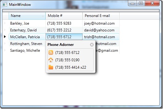
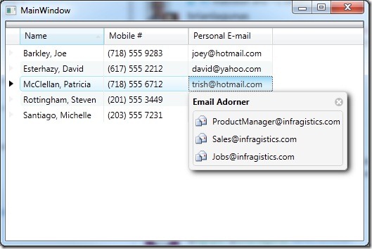
And here are the results of the other two FieldAdorners.
I would like to point out that you can make your FieldAdorners as complex as you want with as much functionality as you like. If you look closely the email adorner allows you to click on the “Email” icon to send an email to the corresponding address. To improve performance only one instance of the adorner control is ever created and is shared for every adorned cell in a single grid.
If you have any question or would like to let me know how awesome my post was, please feel free to leave your comments below.
Don’t forget to download the source.


